
Utopie: Texts and Projects: 1967-1978
Edited by Craig Buckley and Jean-Louis Violeau
Semiotexte, $24.95
When Rem Koolhaas and Bruce Mau brought out S,M,L,XL in 1995, one of the more subtle aspects of this megalithic project was the book’s marginalia, where counter currents and trivia were interspersed with OMA’s stampede of images and full blown texts. Among the many critically inspired sources Koolhaas was channeling for his opus was the pioneering publication Utopie, a highly eclectic mixed media platform that some two decades earlier experimented with hypertext, graphic illustrations, and overlaid scribbling.
Assembled together into one comprehensive volume edited by Craig Buckley and Jean Louis Violeau and translated by Jean-Marie Clarke, Utopie: Texts and Projects, 1967–1978 packs a lot of intellectual ammunition. With the likes of Antoine Stinco, Hubert Tonka, Jean Aubert, Jean Baudrillard, Henri Lefebvre and Isabelle Auricoste reflecting on art, media, obsolescence, urban culture and the ins and outs of utopia, there is no shortage of incredibly astute and insightful reflections on contemporary culture, urban, architectural, or otherwise. Perhaps most unexpected is how the succession of reprints can be read as formulas for political contestation, as relevant to these post-9/11 times as they must have been during the Cold War era when they were written.
Specifically, Utopie took shape during the peak years around the French cultural revolution, bringing together one of the most intriguing collectives to emerge during this turbulent post-war decade. But this is not simply another visitation on the sixties that renders one nostalgic and therefore hopelessly removed from the subject. Rather Utopie can be seen as a useful manual, something in the manner of the Whole Earth Catalogue, but instead of herbal remedies for the garden or instructions on how to build geodesic domes, you would find game tactics on how to subvert the dominant class or run a workshop on consumption and pop culture.
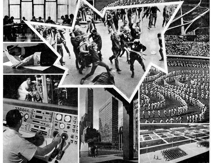
Anything or anyone could end up their target: Utopie published brilliantly perceptive and deeply empowering critiques that dared to take on both the conservative and the Left wing establishments using some very common everyday concepts, including graphic comics, hypertext in the margins, reproductions of articles and advertisements taken from odd sources, as well as piercing analyses and loads of dry humor. There are numerous examples where dazzling displays of graphic images are wittily put to use to undermine the main point presented in the central text, calling into question the fundamental intentions of the authors. Ultimately, Utopie played on one’s basic judgment, questioning one’s intuitive trust in the printed page.
As such, Utopie conjures up a kind of unique textural-graphical “improv,” extemporizing in the margins, playing with blank pages and comic spreads, ultimately developing their colonne critique into a staple editorial device that evolved up until 1971. The magazine persisted for another seven years, but the initially fervent hypertextual energy gave way to more subtle, less graphic and clearly less architecturally inspired perspectives.
The first issue of Utopie presented black rectangular frames stamped on blank paper suggesting an unusual editorial frankness, an anti-dogmatic position atypical of the mainstream Marxist press. Craig Buckley in his introductory text explains the early pamphlets as a combination between Pop and Marxism, with plenty of collaged images from major publication sources, as well as photos taken from random parts of the city, buildings as well as close-up architectural details. According to Buckley, “The emphasis upon construction stresses the formation of theory rather than the application of doctrine, it mirrors Utopie’s own desire to place themselves in a provisional, blank spot within the era’s intensely factional gauchiste politics, it evokes the disparate materiality of an intellectual project assembled from the contrasts between fashion advertisements and sociology, police bulletins, and works of philosophy, but it also speaks to the recurrence of architecture, both metaphoric and literal with the group’s writings.”
Utopie did pay close attention to the key trends in design, art, and architecture: references included Archigram, Architecture Principe, Cedric Price, Hans Hollein and Kisho Kurokawa, among others. But according to Buckley, Utopie, unlike Architecture Principe, remained open to a much broader vision on society then would otherwise be considered in the narrower domain of architecture. The city would therefore remain Utopie’s most fertile cultural platform.
And there is no question that the editors of Utopie, wanted for their principle goal to expose the failings of the modernist project, to demonstrate the inconsistencies and ambiguities that kept society inchoate and hopelessly alienated.
One of the main lessons to be learned from reading Utopie is that looking straight at the problem gets you nowhere. You need to look at the margins.