Unlike nearly every public building its size in the nation’s capital, the Martin Luther King Jr. Memorial Library has an unambiguously local remit. With the recent renovation of its 1972 Mies van der Rohe–designed building, the institution has reaffirmed its dedication to the people who call D.C. home. The project, initially laid out in a 2014 competition entry by Delft, Netherlands–based Mecanoo and further developed in successive iterations, aims to center on the needs of library users. Only those patrons can judge whether the design team succeeded when the library opens to the public in a post-pandemic world. Until then, it is still fair to say that its program, design, and art add up to a strong investment in the potential of residents of the proposed 51st state.
The central branch was one of the last projects undertaken by the unelected government that oversaw the District of Columbia from 1873 to 1973. The library, first envisioned in the early 1960s by white business leaders as a downtown revitalization project, opened in 1972 to a city reshaped by activism and unrest. The effects of this change extended to the library itself. The District of Columbia Public Library board voted to dedicate its anchor branch to the memory of Martin Luther King Jr. and decided that a Black director would supervise its operations. Not long after, Congress devolved municipal and state-level functions to the residents of D.C. It was an exciting moment.
But it didn’t last. The D.C. government struggled to control waves of disinvestment, gentrification, and crime that left it bankrupt by the 1990s. The $18 million library building’s inadequate mechanical systems and elevators began to fail well before then. Mies’s clean lines did not wear neglect well, and as libraries evolved, the deficiencies of the design—from its envelope to its space planning—were obvious.
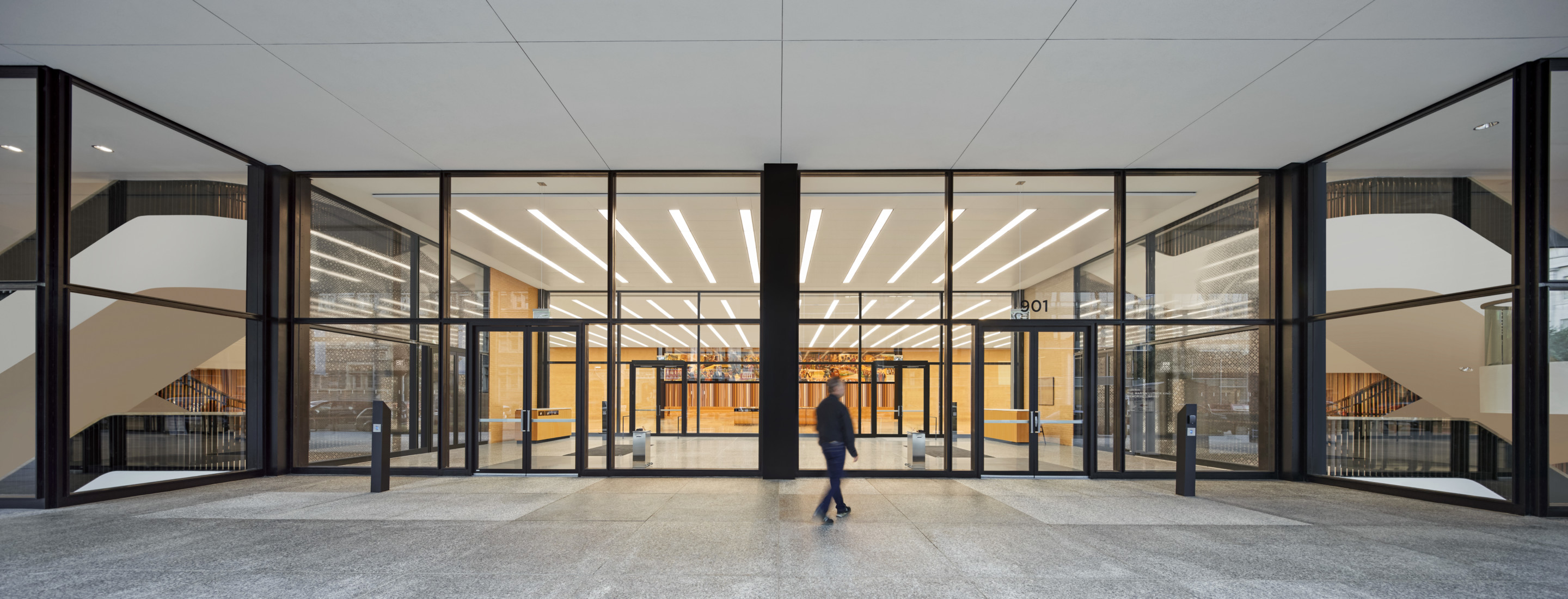
Mies’s parti for the project was characteristically simple: Four buff brick service cores sit in a grid that could go on forever, separated from the outside only by thin sheets of black-painted steel and bronze glass. On the ground floor, Mies set clear glass in black iron frames far back from the outer edge of the building envelope. These minimal walls felt more like partitions between two kinds of public spaces, one indoor and the other outdoor. Even at the library’s nadir in the early 2000s, the great hall and two reading rooms on the ground floor evinced a kind of public grandeur.
The transparency at street level, though, was lacking elsewhere. A consultant brought on early in the renovation process thought the tinted upper-story windows a “special nuisance” in a world of fluorescent light and air-conditioning. Visitors could also be forgiven for thinking the 407,000-square-foot building was much smaller. Before the facility closed for renovation in 2017, library users making their way from the austere entry hall to the stacks upstairs had to pass through dim, claustrophobic cores and undersized elevators, then windowless brick-lined hallways. This feeling of compression extended to the reading areas, where tall bookshelves, arrayed along the perimeter of the floor plate, hindered daylight from penetrating the interior. Readers were to be grateful for these rows of black metal that screened them from distraction.
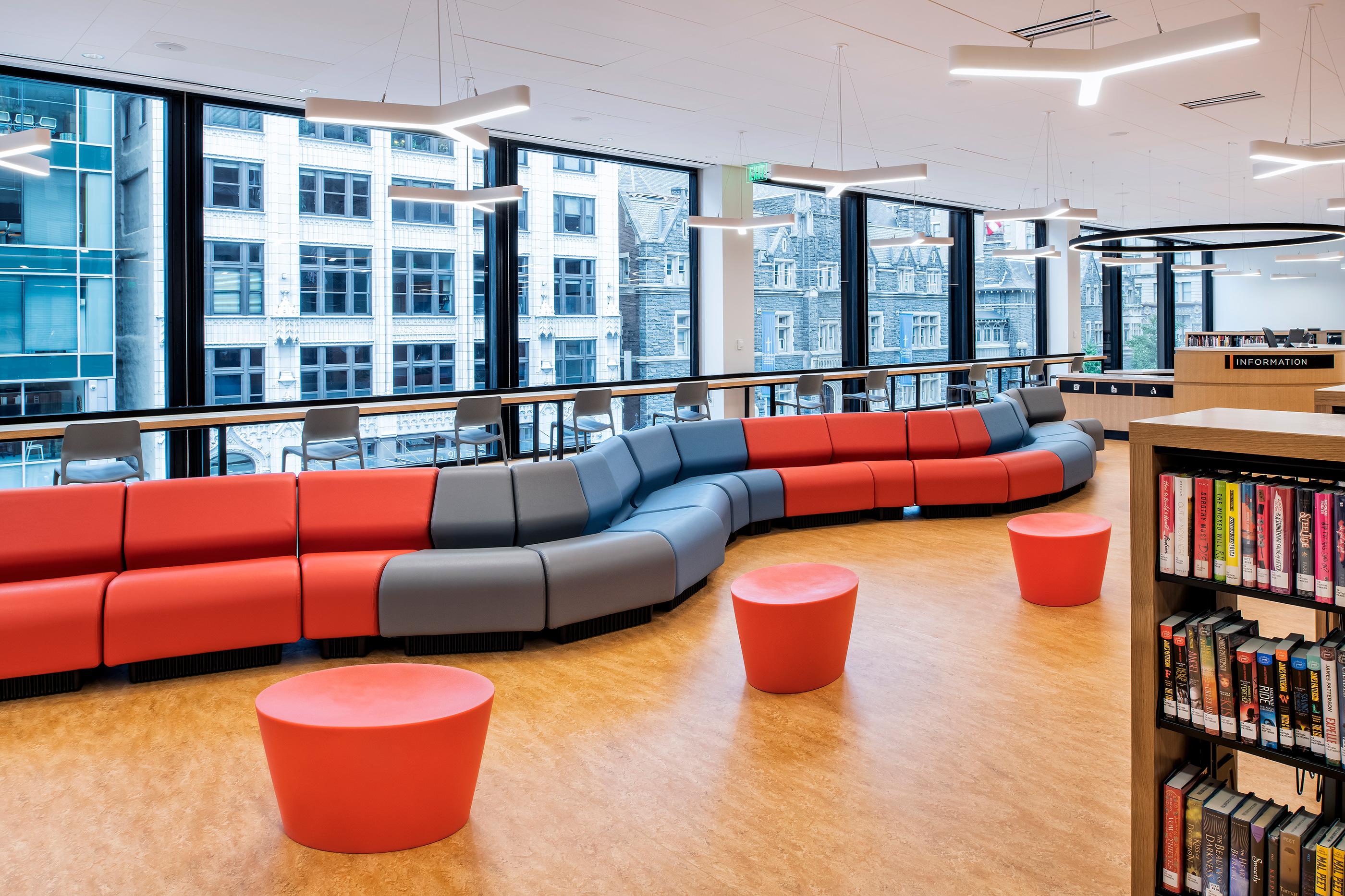
But the buff brick walls concealed a large area roughly 12 bays wide and completely column-free. Removing those walls forms the first of three interventions that tie together a delirious range of activities over 426,000 square feet and five public floors. On floors 2 through 4, Mecanoo and its local partner, OTJ Architects, set down rounded volumes in the open space, wrapping them in vertical strips of white oak. On the third floor, these programmatic bubbles form private coworking spaces as well as offices for organizations serving the unhoused and other marginalized groups that are welcomed into few other spaces in the city. The fourth floor is the most open, with an exhibition space at its center for displaying library special collections.
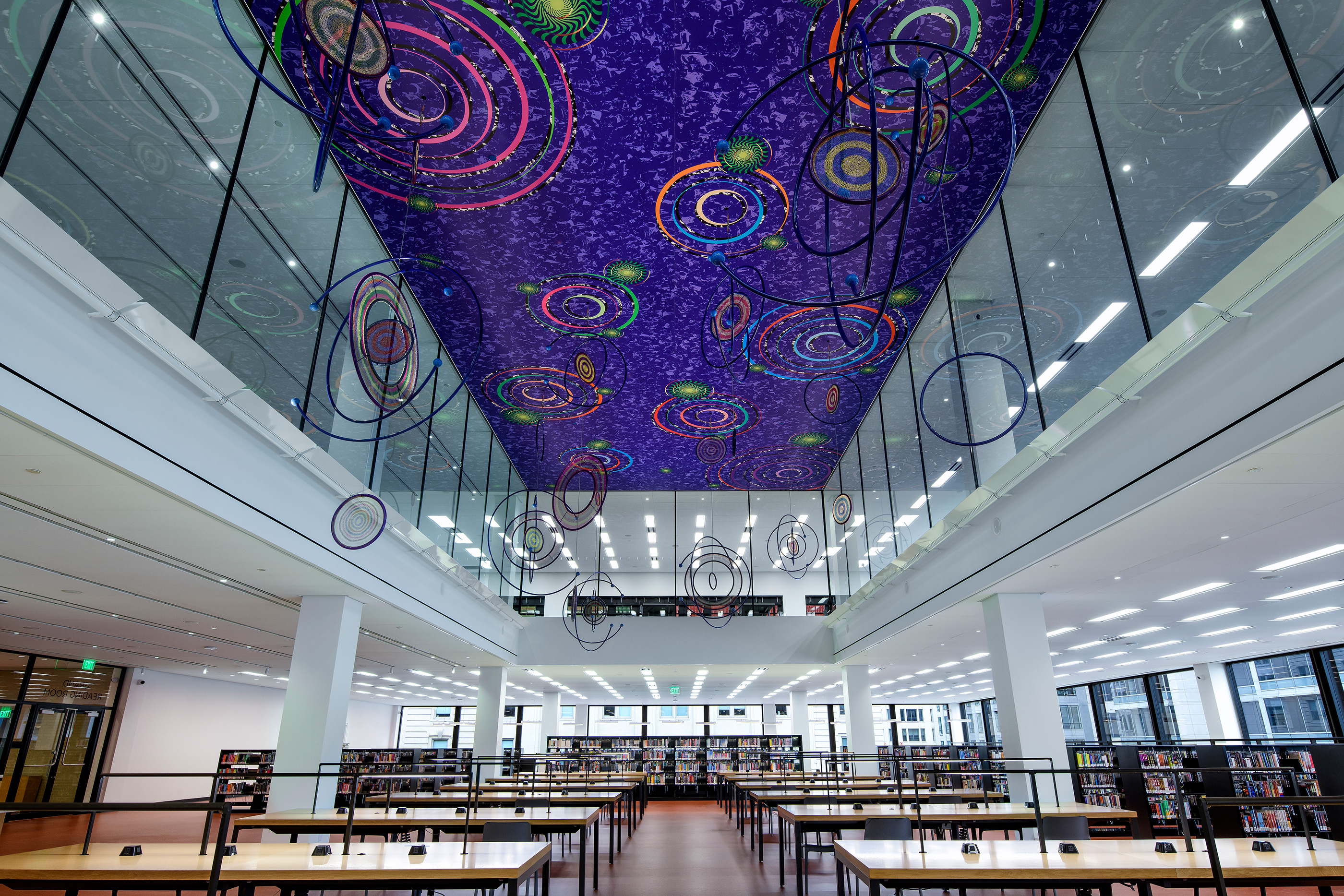
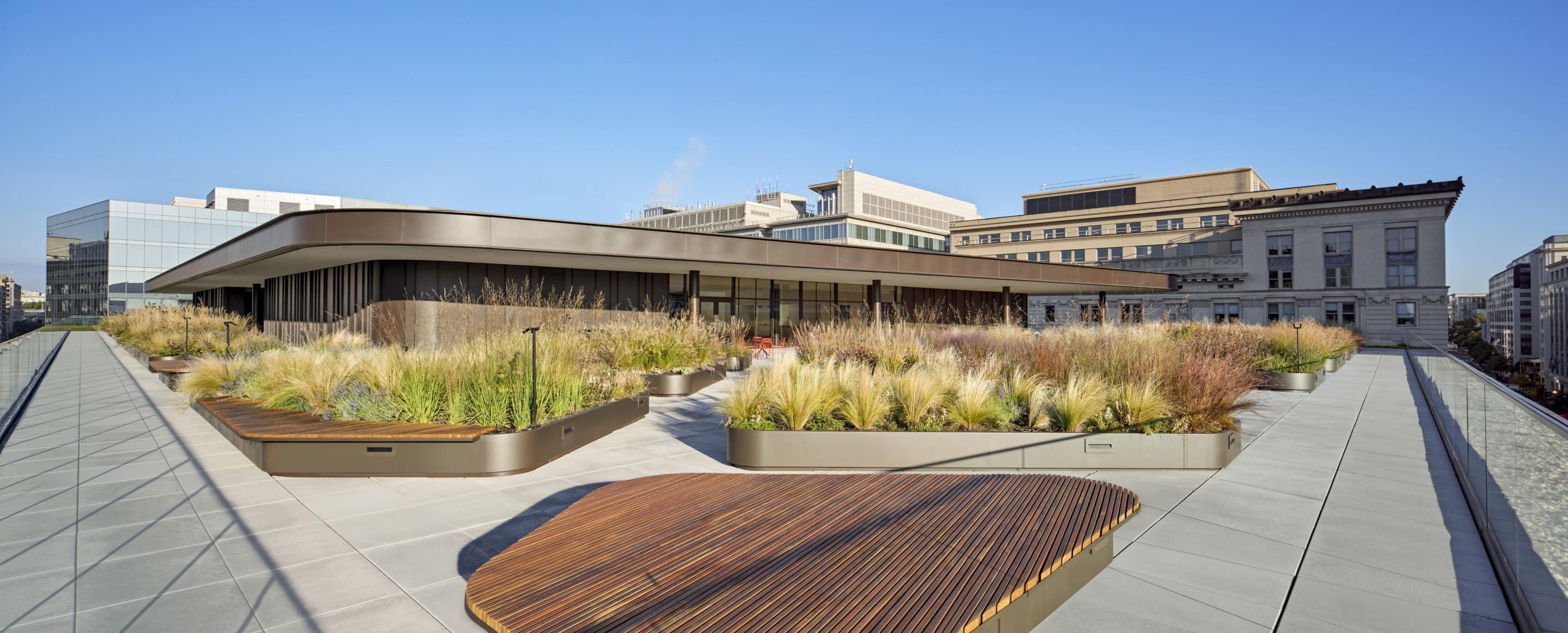
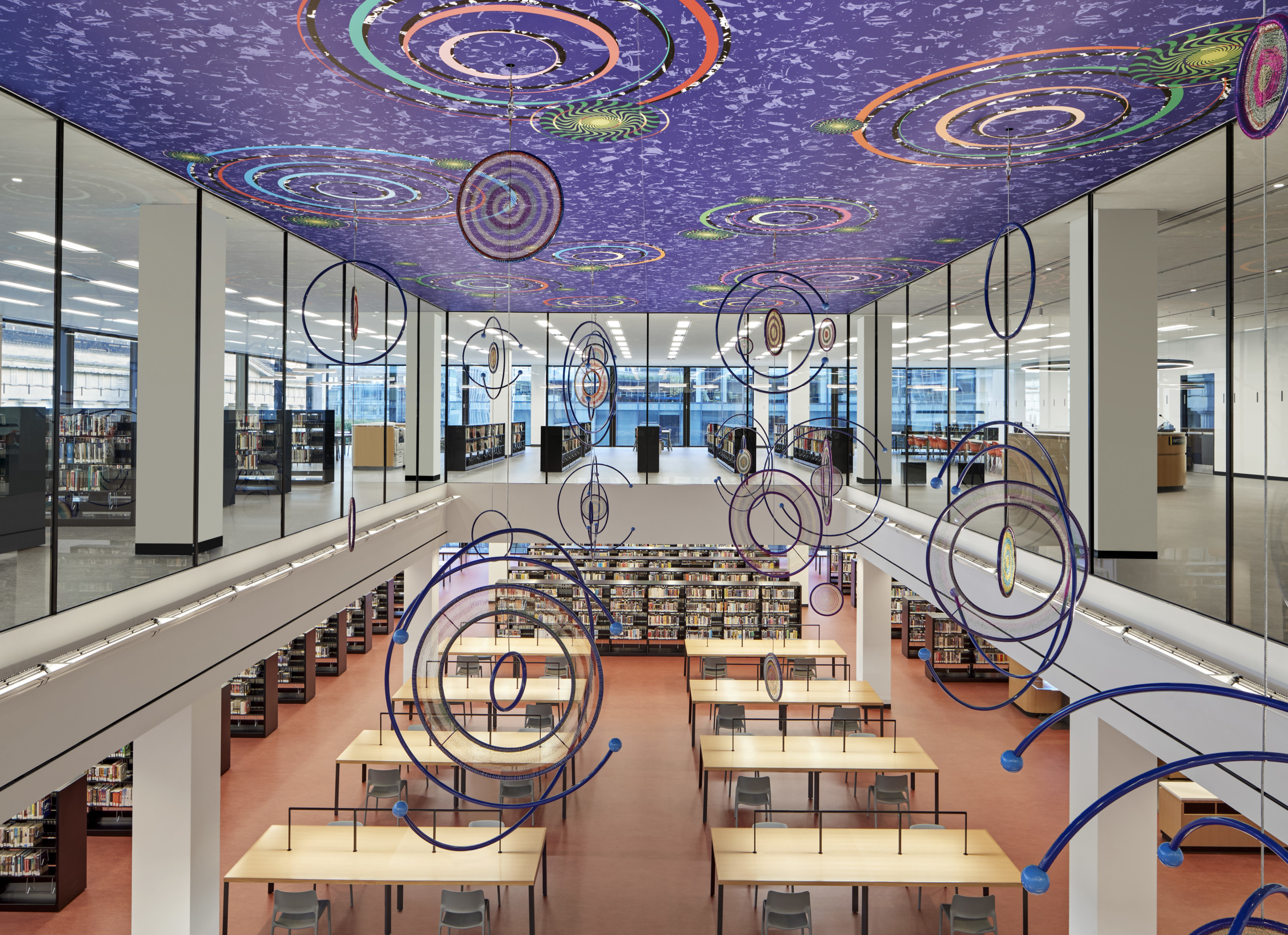
The wood motif is expanded in the 280-seat auditorium, which bridges the fourth and fifth floors. The latter, Mecanoo’s second intervention, pushes up through Mies’s original massing, though only a third of this penthouse level is enclosed. Most is left as a green roof the public can use in whatever way it chooses, a telling indication of the architects’ priorities. While many spaces in the building, like the fabrication lab and the adult literacy room, fit a specific program, the design team worked with stakeholders to create a variety of environments for more undefined uses. For example, visitors now have the choice to reserve secluded rooms in the fourth-floor conference center or to enjoy the view from the seating bar located in the third-floor reading room.
Mecanoo bound these spaces by carefully weaving partitions, countertops, and furniture around extant elements of the Mies landmark, whose most character-defining features have been painstakingly restored or upgraded for better performance (or, in the case of the original single-pane glass facade, both). Cleaving to exhaustive federal and local historic preservation guidelines, the designers made sure to modulate the contrast between old and new construction. Bright colors—as in the second-floor children’s library—and the aforementioned white oak do most of the work. Happily, in some cases the distinction is blurred: the seating stairway on the north side of the great hall could easily be mistaken as original.
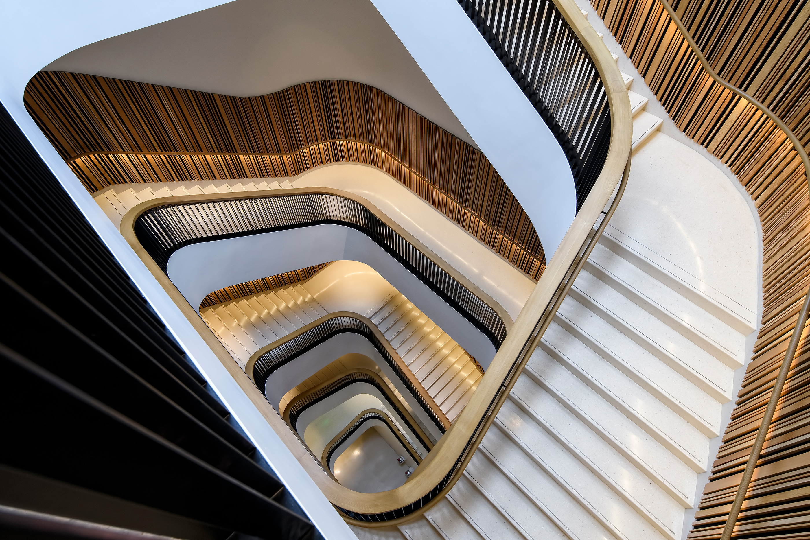
Curved corners and departures from Mies’s grid make statements elsewhere, as in the project’s third key intervention: Two monumental stairs hollow out the blind brick cores, which are opened up almost into atriums. Visitors can descend under natural light from the top-floor event space to basement recording studios.
Mecanoo and its director, Francine Houben, deserve credit for working through the nuances of Mies’s style while sticking to changes that improve the library’s function and user experience. The project team was helped in this aim by a methodical set of preservation guidelines and by the carefully managed competition. Both set the project on the right course before any designer became involved.
In that way, the rehabilitation is a product of years of advocacy to save the library while also enhancing its architectural and public character. From the early 2000s, the library’s arc bent from plans to sell the building to heavily altering it for a public-private partnership, even locating the District of Columbia’s long-neglected archives there, before settling on a stand-alone renovation by 2015.
However, in a few places, the project’s aesthetic compromises illustrate the incoherence of D.C.’s preservation process. The most visible demonstration occurs at the corners of the cores flanking the entrance vestibule at G Street, where the new curved staircases have been inserted. There, reproductions of Mies’s first-floor facade have replaced rectilinear chunks of buff brick. This pastiche undermines the original contrast between the clear enclosure and opaque cores. Likewise, it muddies the differentiation between old and new.
It did not have to be so. Early on, Mecanoo proposed removing much more brick but also using translucence and lighting effects to create a ghostly solidity. That would have been an opportunity to draw on the subtle attitudes about transparency and reflection that scholars such as Eve Blau and Detlef Mertins have shown Mies held when not subject to value engineering, as he was in D.C.
Pressure from preservation officials instead steered the design team to match Mies’s barely-there partitions in proportion, detail, and affect. The compromise solution to this corner problem is unsatisfactory, both as a preservation measure and as an alteration. It goes against federal standards and even the guidelines given to the design team. The approach comes across as rooted in an anxiety about adding to history that D.C.’s design review process seems structurally incapable of overcoming.
Fittingly, where the design falters, the occupants have made it succeed. The library has adhered halftone images to the glass corners that restore something of the translucence of Mecanoo’s initial design. The one on the west facade commemorates Dr. King, while its opposite on the corresponding east facade depicts a recent Black Lives Matter protest. Each dot in the supergraphics hides a protest sign created by high school students.
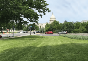
The building places its politics upfront in a return to the state it was in during the 1970s. Just as it reflected the promise and precarity of home rule in the 1970s, the transformed building matches a District of Columbia that is more self-assured, pursuing yet more democracy in the form of statehood. The new Martin Luther King Jr. Library suits the mood in town by putting the people of D.C. at the center.