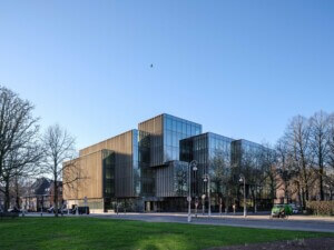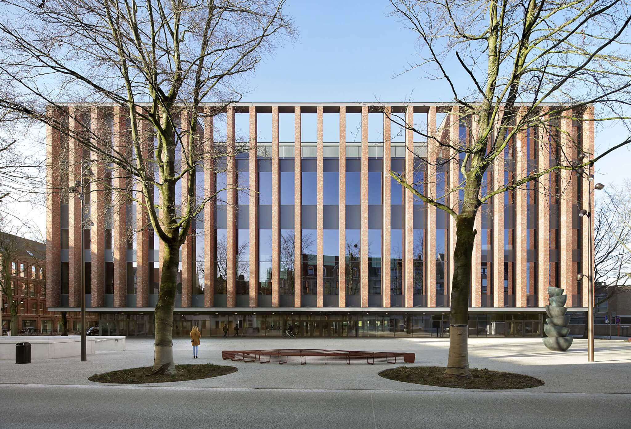


The Bruges Meeting and Convention Centre (BMCC), designed jointly by Belgian office META and Portuguese architect Eduardo Souto de Moura, is an exercise in grandiose modesty. Its imposing front facade dominates the small public square over which it looms, but the project’s mimicry of materials and rhythms found in the vicinity makes the bulky structure surprisingly affable. Its friendly nature notwithstanding, the promise of wholesale appropriation by the community—the massive hall can be turned into a public plaza by opening the glass walls on all sides—has yet to be fulfilled, as managerial reluctance has prevented local residents from taking full possession of the building.
This effort, the first collaboration between the two distinct (and distinguished) architects, has produced a significant building. During a visit to the center on a hot summer morning, Eric Soors, architect and managing partner at META, recounted a telling anecdote: Having been presented with META’s work prior to the start of the project, Souto de Moura apparently exclaimed, speaking French to even out the difference between Portuguese and Flemish: “Nous parlons la même langue!” (“We speak the same language!”) And while that might not literally be true, the BMCC shows a clarity and consistency that enable it to comfortably reside in the portfolio of either atelier.
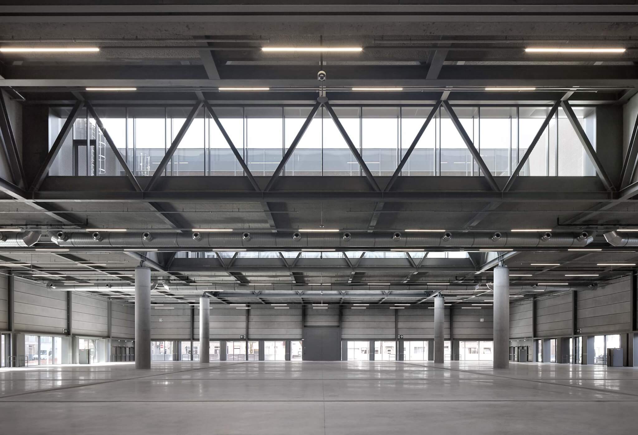
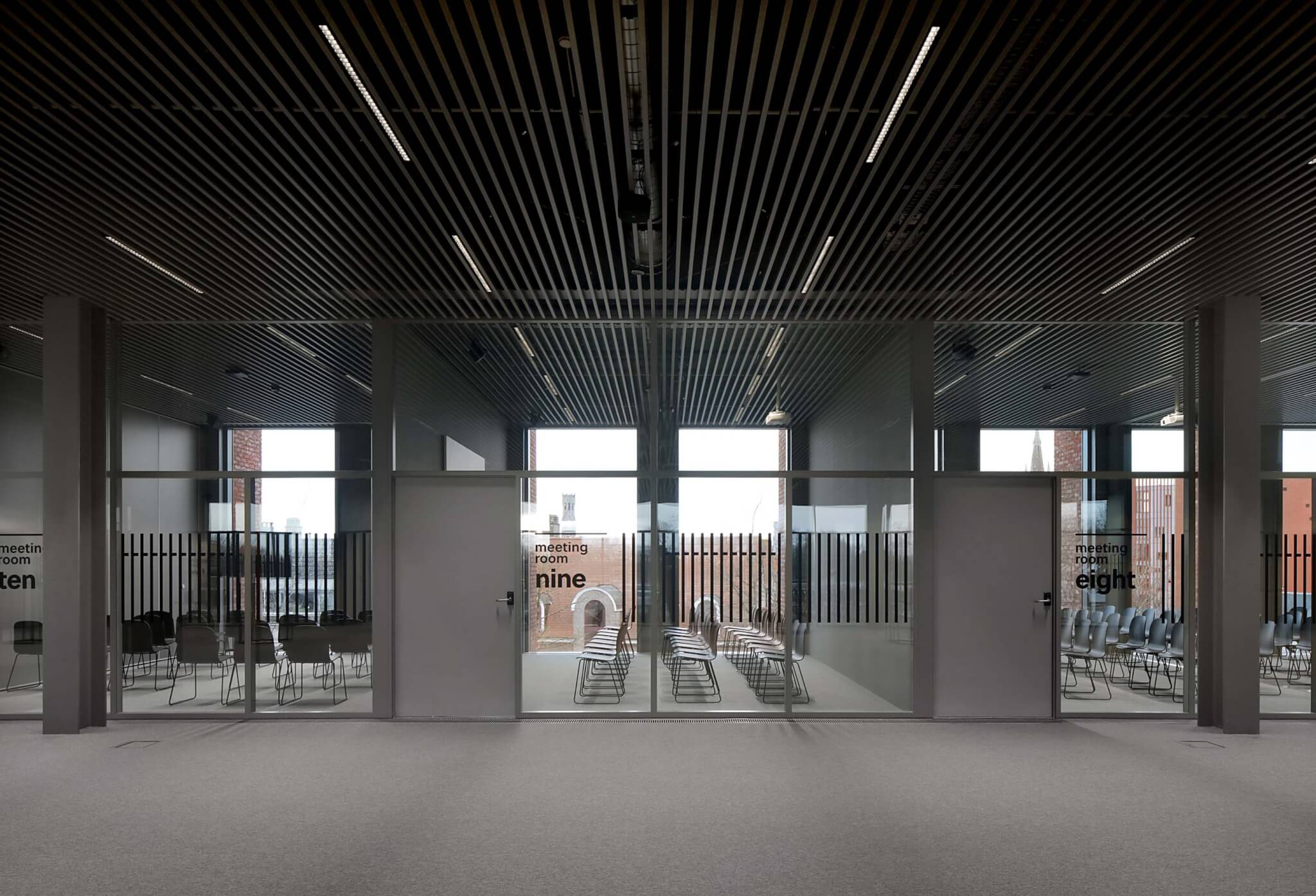
That clarity is, Soors explained, not just a matter of taste: It was also the only way to fit the ambitious program—an approximately 48,000-square-foot expo hall and a conference center capable of hosting 500 visitors—on a small site. The chosen solution is elegantly simple: The ground floor consists of an enormous hall preceded by an entrance area containing two vertical cores (one for visitors, one for logistics), while the three levels of conference center are stacked on top of the lobby. Space is used efficiently throughout, as are materials. The glass-and-brick exterior is complemented inside by exposed in situ concrete walls, large rectangular windows, and a ceiling of sleek gray louvers through which ducts and cables can be glimpsed. Structural work has largely been left exposed, giving the interior a somewhat austere atmosphere.
Still, the minimalism of the BMCC feels distinctly chic. Proving that trade fairs and conventions can do without glitzy casino carpets and faux crystal chandeliers, the straightforward design approach has produced a building that is easy to understand. It exists to facilitate the events it will host—and to do so effortlessly and generously. The efficiency never turns uncomfortable, owing to the (very) high ceilings and ample outside views throughout the building.
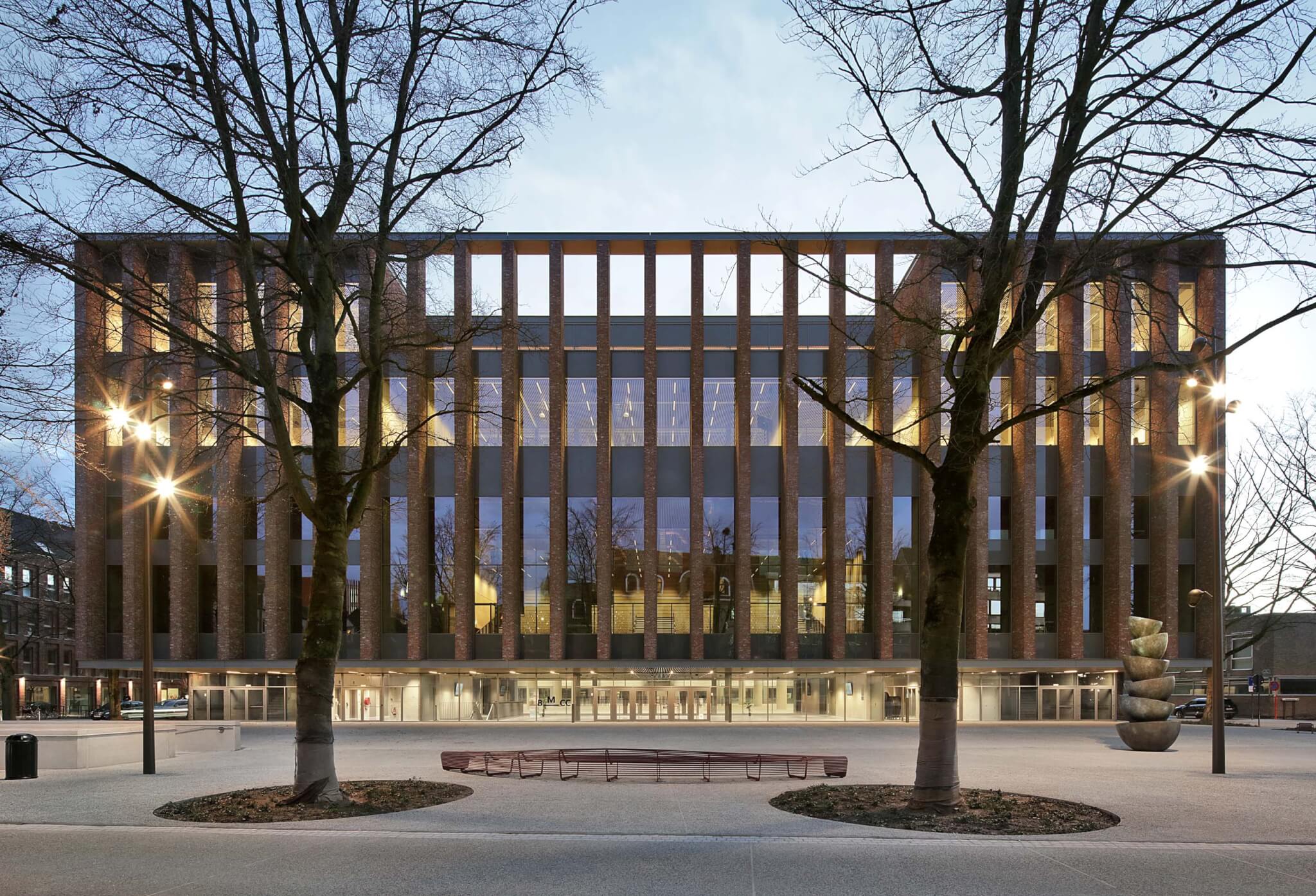
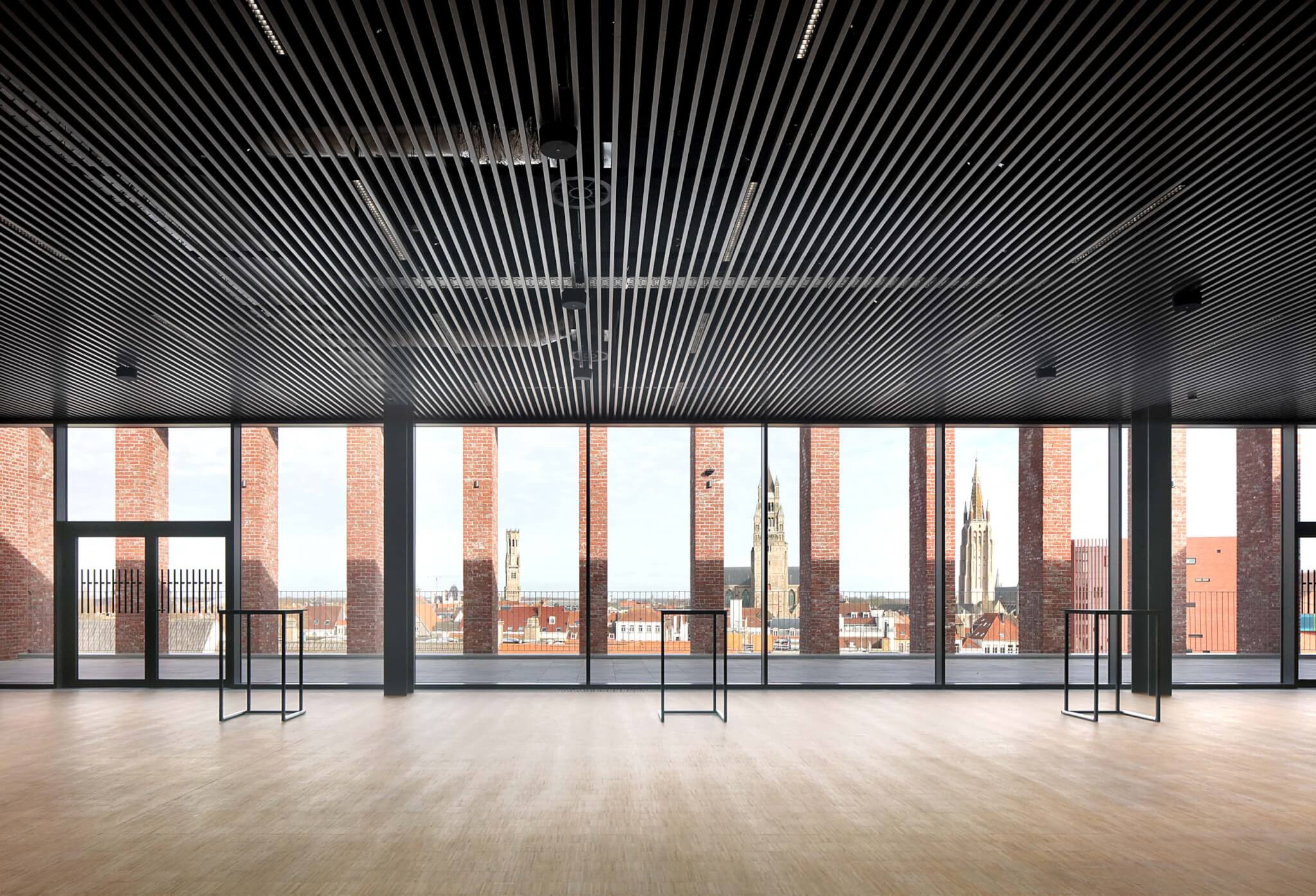
There is poetry, too, in the proportions of spaces, the thickness of walls, the distribution of mullions, and the careful placement of columns. The conference center features an upward promenade that spans three floors, offering increasingly impressive views of the surroundings that culminate on the roof terrace, where the city’s famous medieval skyline unfurls at your feet. This journey takes place directly behind the impressive front facade, a floating grille of vertical brick mullions stacked between two thin horizontal metal channels. Because of the large depth of the thin brick piers, which provide shade and security to the spaces behind them, the grille offers passersby a shifting view of the interior: It’s opaque at an angle but transparent when viewed head-on. An enormous 26-foot cantilever makes the facade hover almost ominously over the main entrance. (The gesture elaborates META’s design of a building for the University of Antwerp completed in 2017.) The result is as blunt as it is impressive.

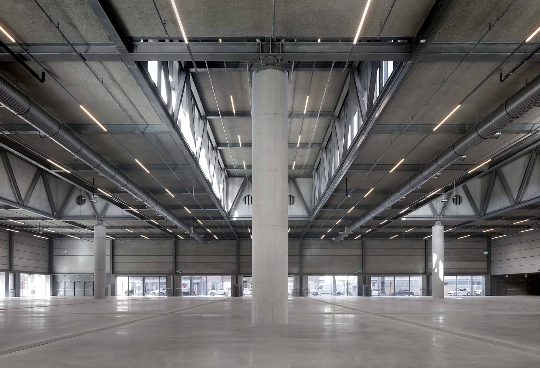
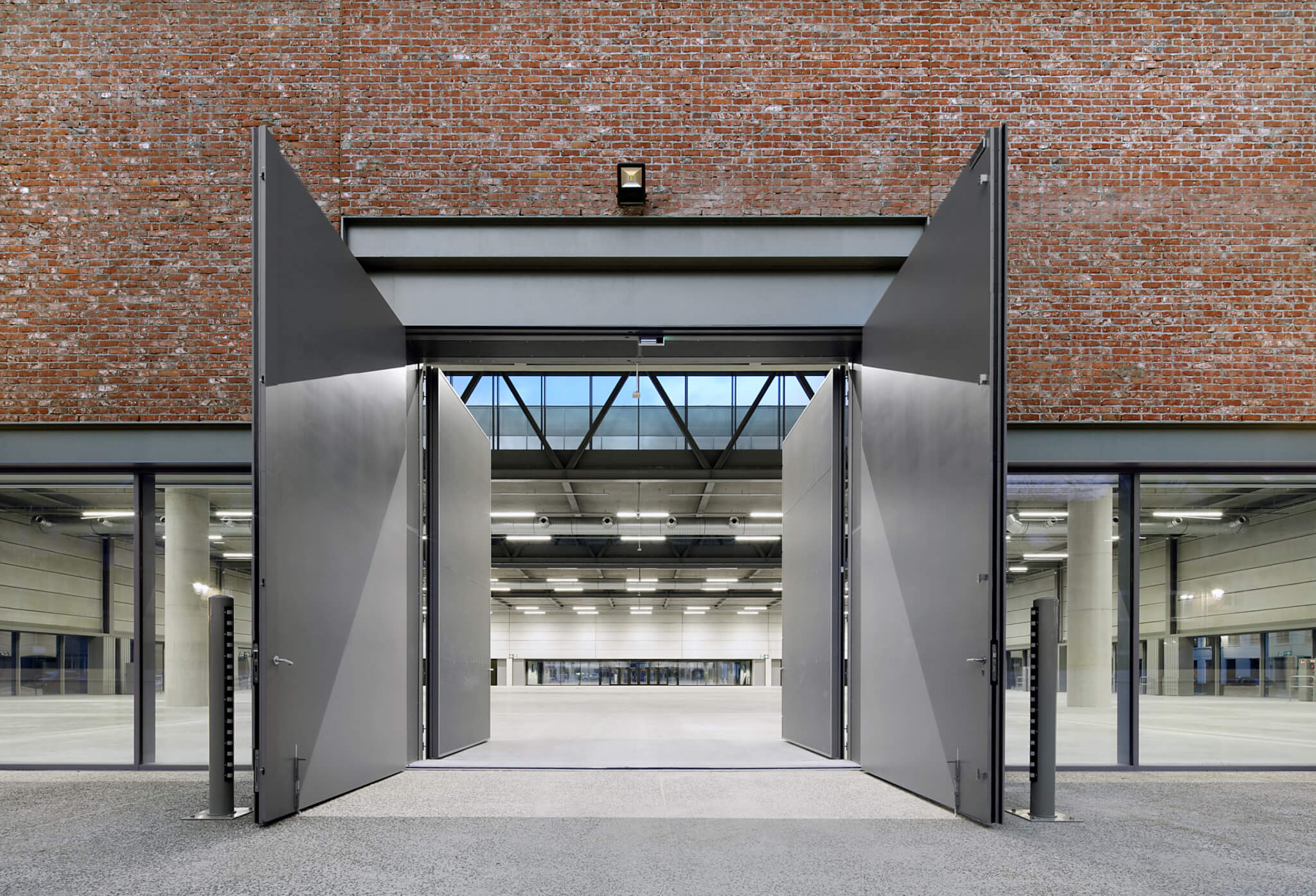
The enormous interior of the expo hall is blunt and impressive also. Its roof, a grid of steel trusses, is carried by six enormous concrete columns that are the only elements standing on the otherwise unoccupied concrete floor. Despite its size, the hall is well lit thanks to sunlight flooding in through light wells in the roof and a ground-level glass facade on three sides.
The glass on the ground floor is part of a nice tectonic trick: While the upper floors of the building are clad almost completely in brick, the ground floor is wrapped by rows of windows and grayed-out doors and panels. The “upside down” application of materials—heaviness above, lightness below—adds daring to a volumetric expression (that of a big, closed-off box) that could’ve ended up quite bland without it. At the same time, the openness underneath the mass of floating bricks dissolves the difference between inside and outside, communicating the building’s desire to be hospitable.
That ambition has not yet been fully realized. The curtain wall is, in spirit, meant to be a permeable membrane that allows locals and passersby to freely enter and appropriate the hall when no event is underway. So far, that has not happened, as postpandemic blowouts are rare, and building managers have so far been reluctant to leave this state-of-the-art space unlocked for unsupervised individuals to explore as they see fit. The BMCC certainly possesses a polyvalent quality similar to Cedric Price’s Fun Palace concept, which makes the securitized entries more unfortunate. Moreover, rather than allowing for an open flow of users across the ground of the old city, the way the building forces residents to navigate around its mass emphasizes how tightly the building fits inside its context.
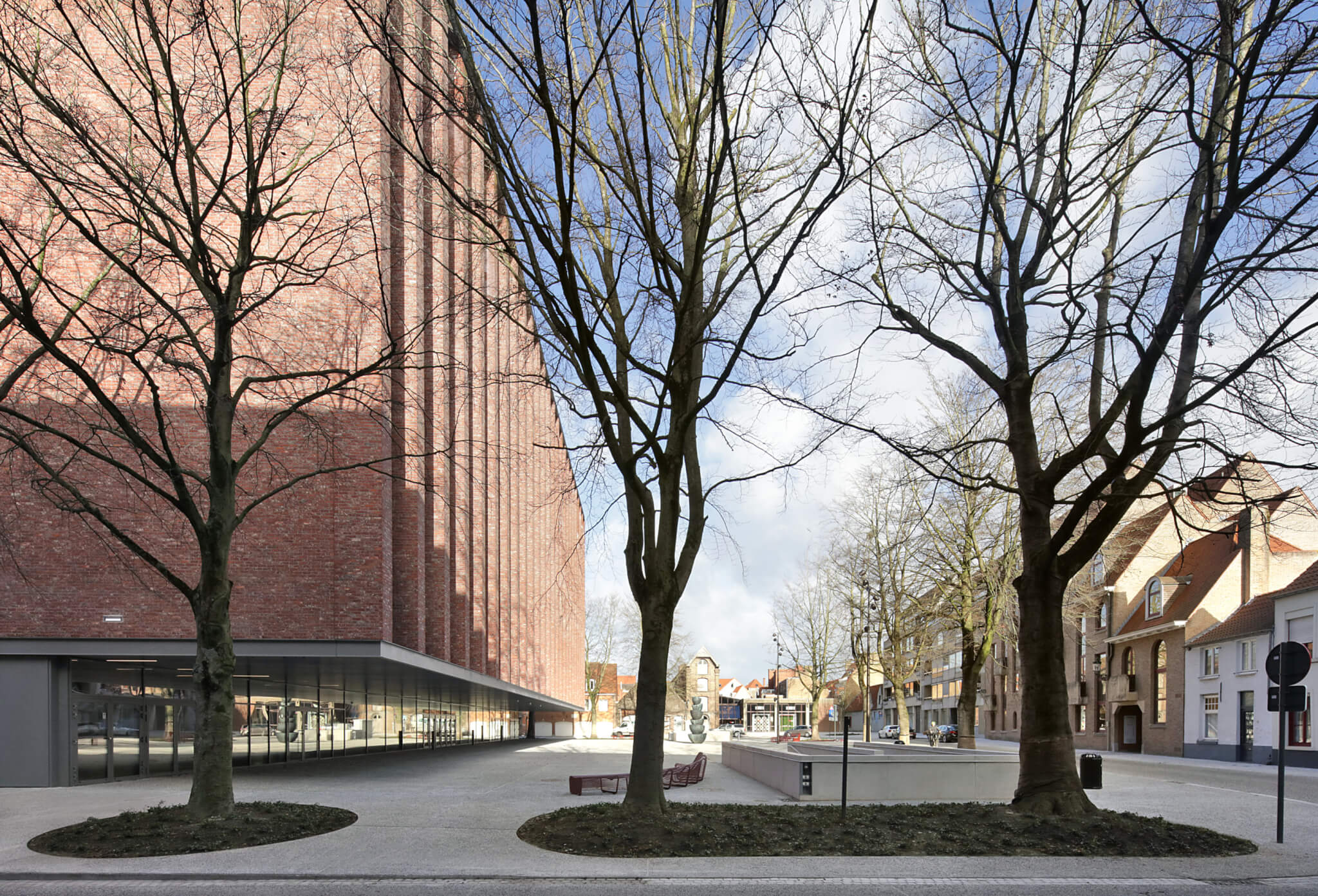
The BMCC is wedged between rows of beautiful old trees on three sides that could not be cut down or moved during construction. (The subterranean parking garage is actually narrower than the building itself to leave room for the tree roots.) With all but the front entrance closed, the large building hulks among both the vegetation and its medieval neighbors. That the structure replaces a less welcoming (and only slightly smaller) predecessor only partly absolves the BMCC from the delayed experience of its openness.
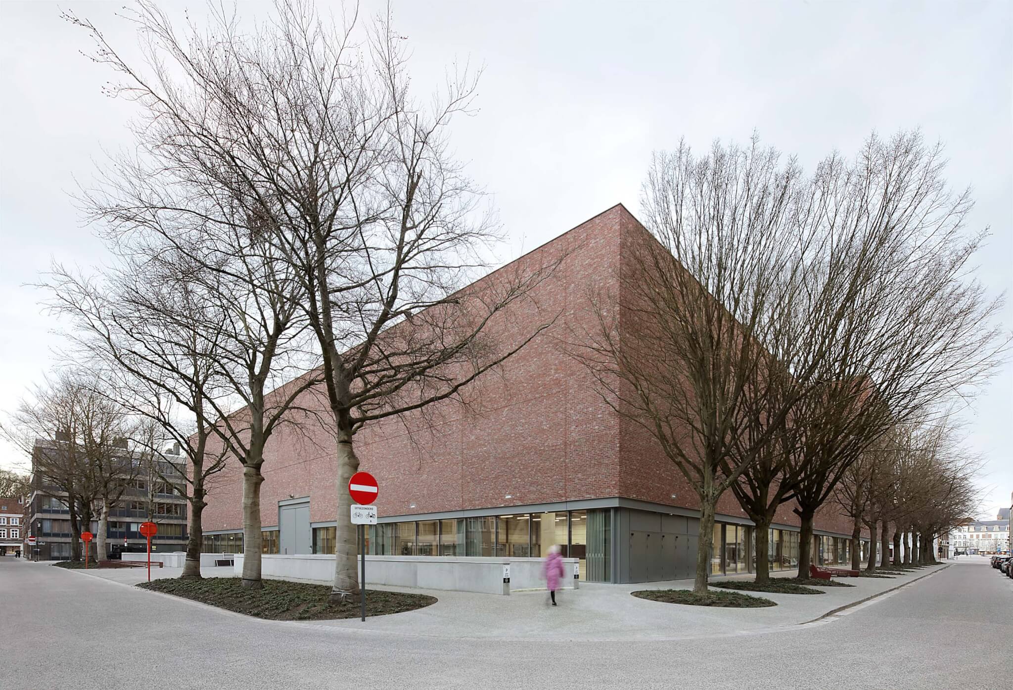
The BMCC is Souto de Moura’s second project in Belgium, after a crematorium in Kortrijk was finished a decade ago. It’s also his first building to prominently use brick, though a notable usage occurred in the laminated end wall of his Casa das Artes in Porto, finished in 1991. For META, on the other hand, the brick facade fits neatly within a portfolio full of masonry. In Bruges, an atypical brickwork detail is used: Excess mortar in the joints between the rough, white-speckled bricks has been left in place. This utilitarian finish paradoxically required special instructions for the bricklayers, who—being skilled professionals—weren’t used to leaving their work “unfinished.” The Bruges municipality also received at least one email from a concerned citizen wondering whether the builders were cutting corners.
The venue was finished within budget and on time, despite the pandemic’s preventing both offices from meeting in person and making it impossible for the Portuguese architect to visit the construction site. Those statistics are impressive enough, but the singular consistency of both the design and its execution betrays a pleasant partnership; I would not be surprised to see further collaborations between two offices that really do speak the same language.
Tim Peeters is a Dutch architect and writer living in Brussels. He currently works for design group ORG. In 2022, he cofounded FALSEWORK, a research and design studio based in Rotterdam and Brussels.