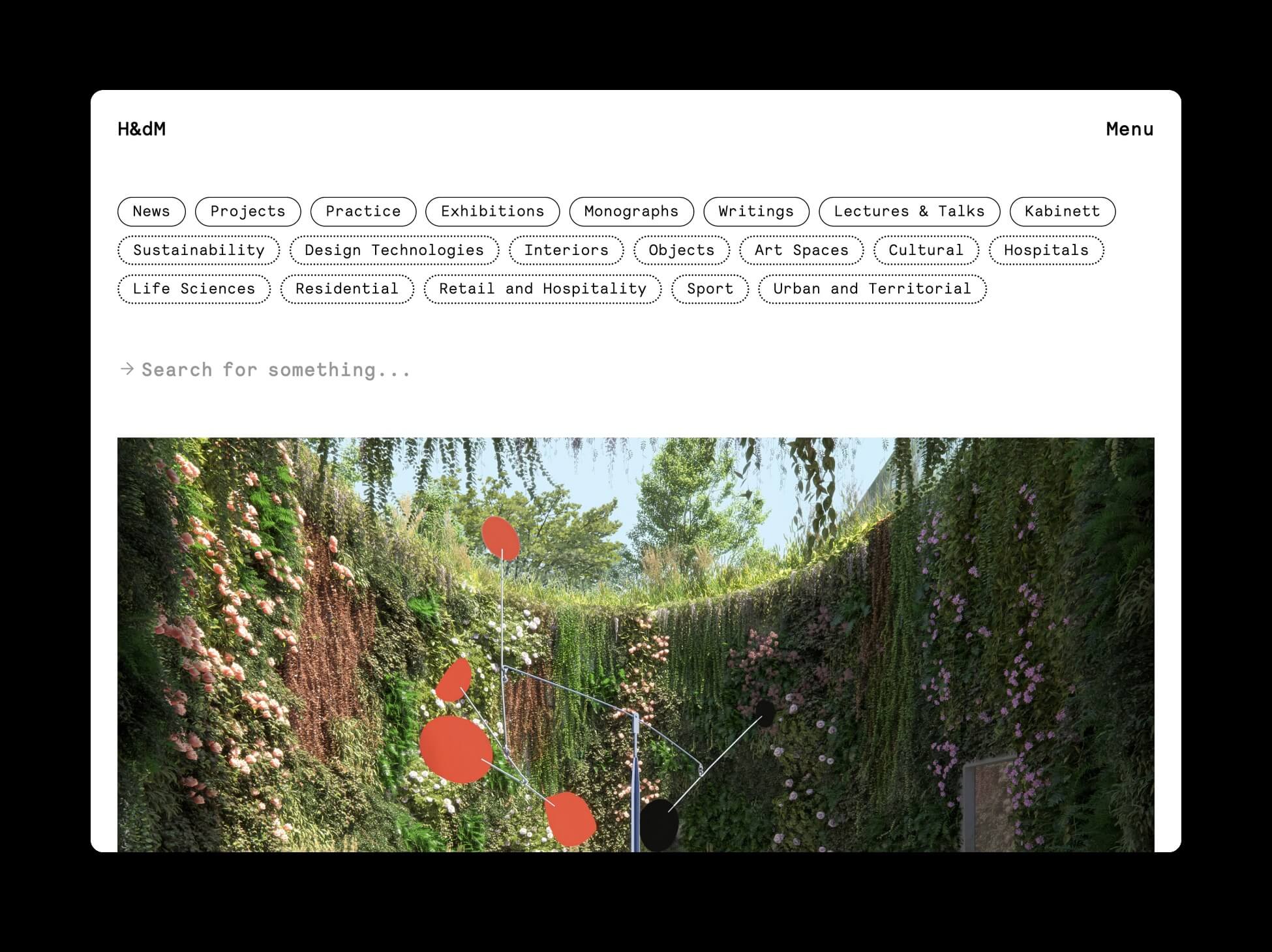
Herzog & de Meuron has a new website design.

According to the firm the new website “reveals the extensive and sometimes surprising connections within the world of the practice through fluid navigation and features including a robust search tool and ‘Related’ sections on each project page.”
At the top of the homepage page, site categories (news, projects, monographs) sit in solid oval bubbles above topics-slash-subcategories (art space, sport, residential) in their own dotted-line ovals.
A click on the “projects” tab reveals a scrollable grid of the firm’s work, pictured at top, with each project represented by a single image. A click on any of the hundred-plus images reveals project details.

On the old site, the menu was on the left side of the page, with projects in a nested menu, pictured below.

The news of Herzog & de Meuron’s new site comes on the heels of BIG’s recent site upgrade that swapped Flash-era pictograms for a more contemporary and phone-friendly design.


