It’s almost 2023. In the design world that means it’s time for the hotly-anticipated Pantone Color of the Year reveal.
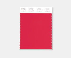
This year’s color is a magenta, a sexy reddish-purplish-pink (pinkish-purplish-red?), the M in CMYK, the shade exactly between red and blue on the color wheel. This particular shade, christened Viva Magenta, also happens to be very close in hue to the one TikTok uses for its notifications. It’s tech-y and unnatural but lively, a vigorous antidote to the extremely depressing past few years. Pantone characterizes the choice and the mood as “an unconventional shade for an unconventional time.”
In yesterday’s reveal at Art Basel Miami, Pantone Color Institute Executive Director Leatrice Eiseman explained the choice in a statement: “In this age of technology, we look to draw inspiration from nature and what is real. PANTONE 18-1750 Viva Magenta descends from the red family, and is inspired by the red of cochineal, one of the most precious dyes belonging to the natural dye family as well as one of the strongest and brightest the world has known. Rooted in the primordial, PANTONE 18-1750 Viva Magenta reconnects us to original matter. Invoking the forces of nature, PANTONE 18-1750 Viva Magenta galvanizes our spirit, helping us to build our inner strength.”
An unconventional shade for an unconventional time:
a new vision. Color of the Year 2023: PANTONE 18-1750 Viva MagentaVibrating with vim and vigor, a shade rooted in nature descending from the red family demonstrating a new signal of strength.https://t.co/vxEQlBykRT#Pantone pic.twitter.com/pRIP6bI2NH
— PANTONE (@pantone) December 2, 2022
With tens of thousands of colors to choose from, you may be wondering how one color beats out all other colors to become the Color of the Year. Since 2000, experts from the Pantone Color Institute have analyzed global trends in art, entertainment, fashion, travel as well as trends in media, sports, and tech to hone in on a shade. Twice a year representatives from color standards group worldwide meet in an unnamed European capital city to choose a color for the next year.
This year the group used AI image generator Midjourney to create the color. To promote it, Pantone has again partnered with the immersive exhibition firm ARTECHOUSE for Magentaverse, a pop up show at ARTECHOUSE’s Miami Beach location. That exhibition opens tomorrow, December 3, and will feature interactive rooms that “plunge attendees into an array of visual, auditory, and tactile experiences.” (More information and tickets are available here.)
It’s tradition among designers and critics to trash-talk the Color of the Year. This year is no different. “It almost feels like the millennial pink of yesteryear run through an algorithm to make it feel ‘post-pandemic’ — that kind of Roaring Twenties redux,” New York Times’s Jeremy Allen quipped. His colleague Louis Lucero II had pointed words for Pantone’s branding “like the shade itself, [Viva Magenta] seems to insist that we be excited about it, but I’m coming up blank on a reason we should. It’s not a color that you want to live with in any meaningful way, is it?”
Regardless of how critics feel about the shade, each year’s selection has an impact on color trends in fashion, furniture, and interiors.
Last year Pantone picked Very Peri as Color of The Year, the first time in its 23-year history that the company eschewed shades from its archive and instead manufactured a color from scratch.